Voice App
Fun, engaging, and easy-to-use text-to-speech mobile application that leverages AI voice integration technology to empower users in their daily communication.
Team
As a UX Designer in a multidisciplinary team, I contributed to the entire design process of the project, with a focus on Information Architecture, Interaction, Wireframing, and Prototyping.
I collaborated closely with a diverse group, including a Researcher, Product Manager, Visual Designer, Marketing Specialist, and Engineers.
Tools
Miro
Figma
Adobe XD
Illustrator
Methodologies
Competitive Analysis
Survey
Interviews
Card Sorting
Personas
User Journey
Wireframing
Prototyping (+ Voice)
Usability Testing
The Problem
In today’s fast-paced world, effective communication is vital for personal and professional interactions.
The problem we aimed to address is the communication barriers faced by individuals in various situations. Language limitations, speech impairments, permanent or temporary disabilities, and other challenges can hinder effective verbal expression.
The Opportunity
The goal was to develop a playful and engaging platform that fosters communication through digital voice, akin to the experience of applying Bitmoji or Instagram filters to voice interactions.
Our objective was to develop a user-friendly and accessible solution that empowers all individuals to communicate confidently and effortlessly, utilizing the capabilities of AI-driven voice technology.
To ensure alignment with the client’s vision, our team actively listened to their requirements and translated them into clear goals.
Expand audience
Scale the business
Shareable
The power of AI voice
Engaging
Audio effects
The Solution
The solution was the development of a playful and engaging iOS app. The app enables communication through digital voice, providing users with a fun experience similar to applying Bitmoji or Instagram filters to voice interactions.
By actively learning from user feedback and understanding our target audience, we successfully delivered a new on a market user-friendly mobile application.
The app has particularly benefited the younger population, empowering them to communicate more effectively and confidently.
Ease of use
Fun and playful
Engaging User Interface
User-Centered design
AI technology
Apps integration
How it works
The Voice App offers users a diverse and playful range of communication options.
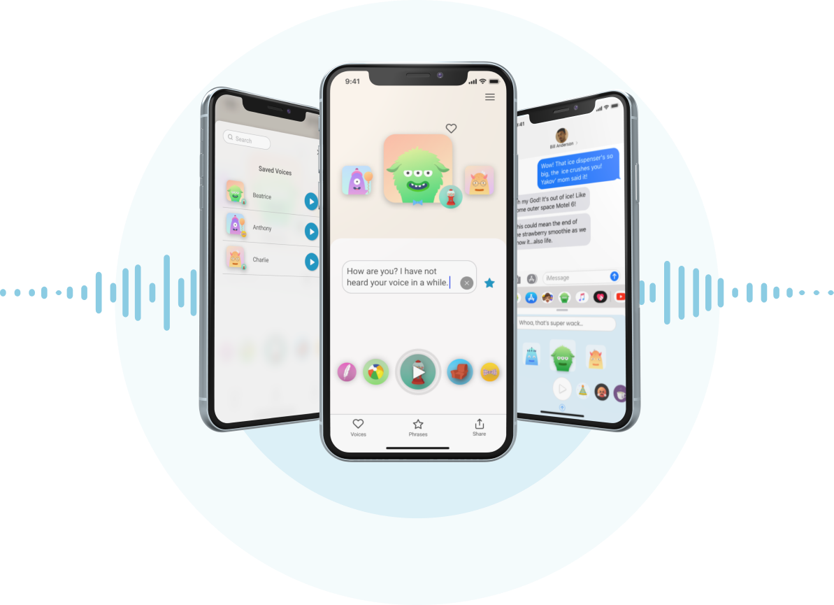
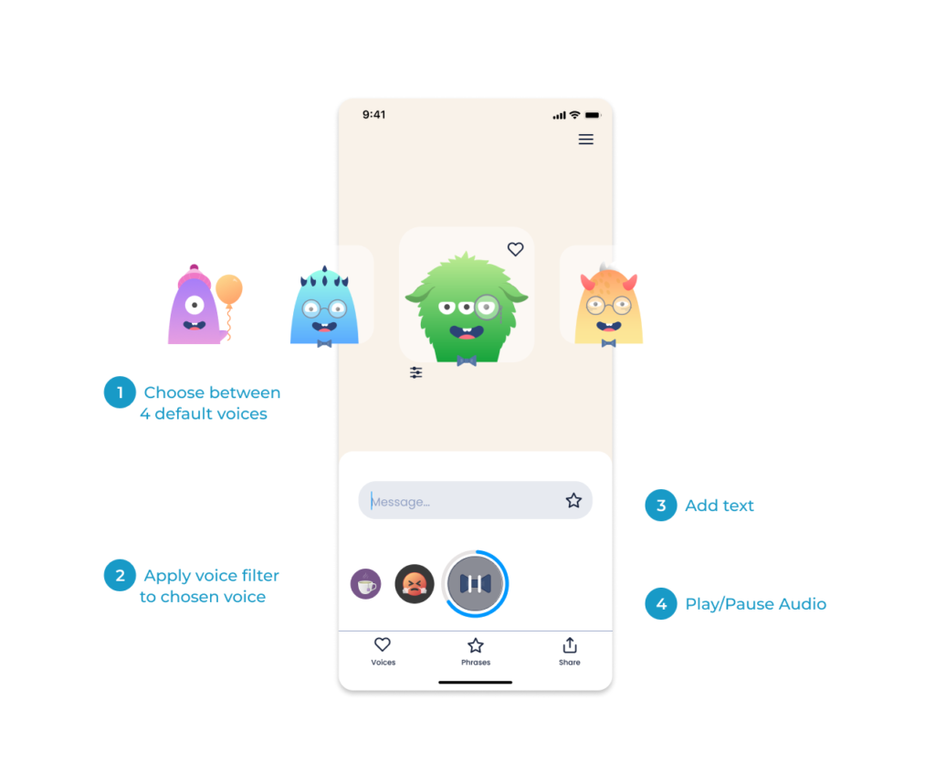
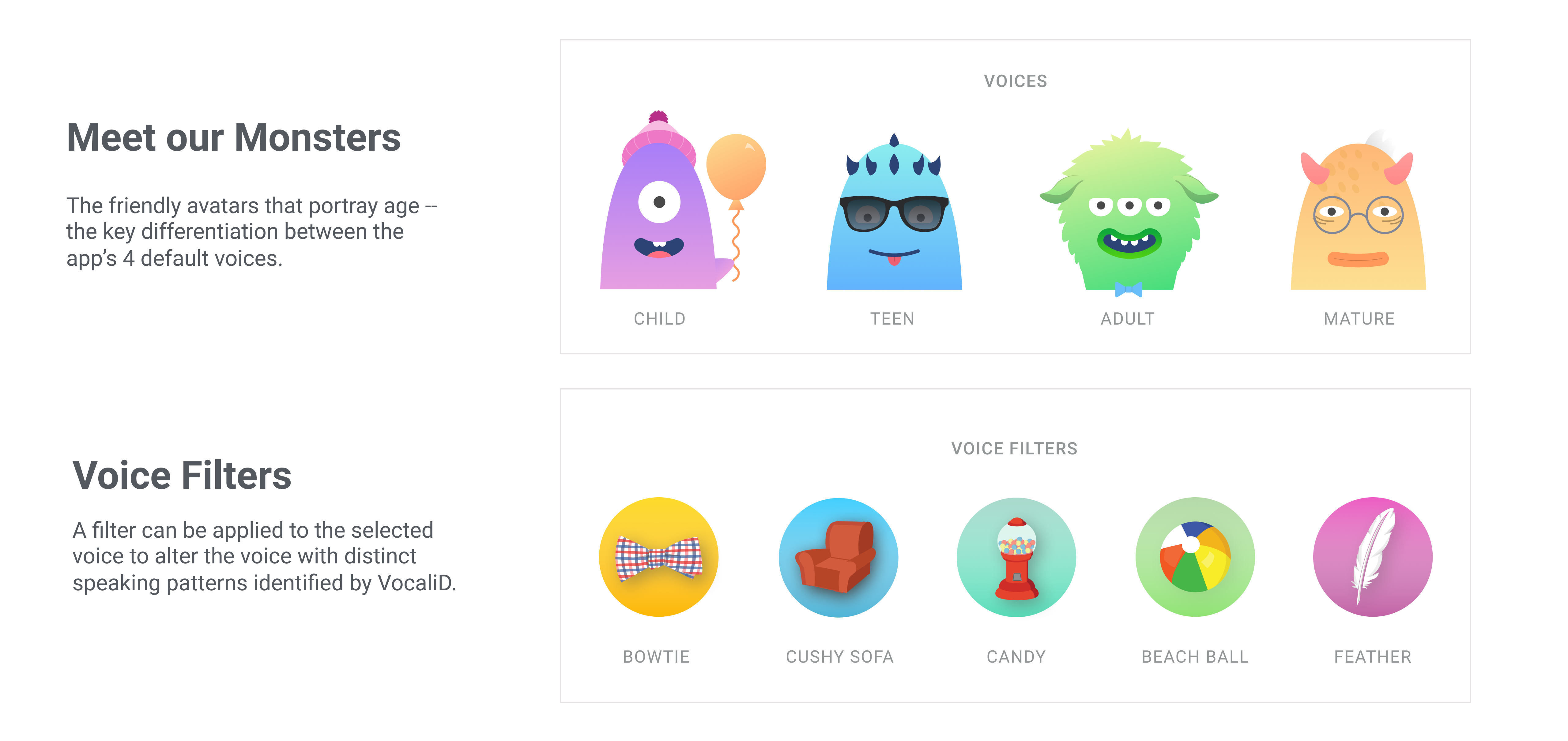
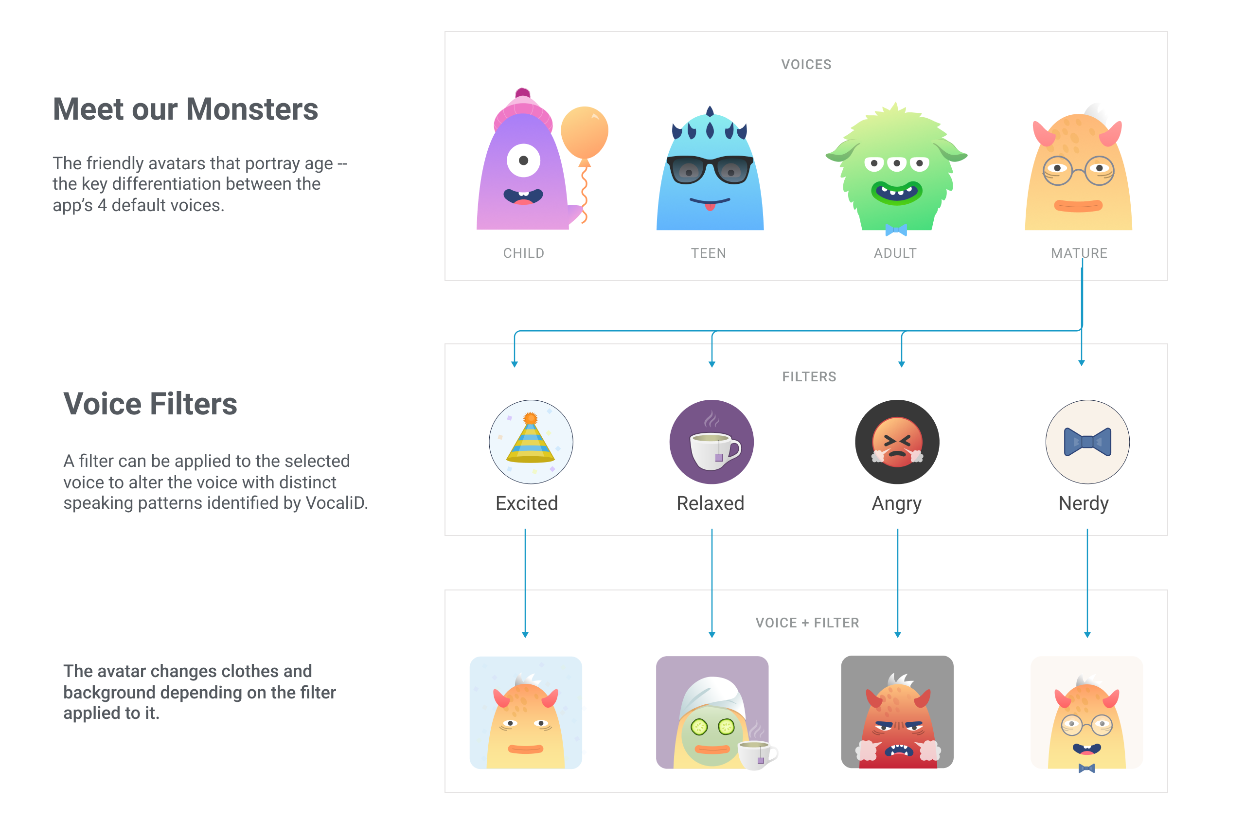
Users can choose from 4 free default voices, spanning different age groups from kids to seniors.
To add emotional flair to their messages, users can apply voice filters indicating excitement, relaxation, anger, or intelligence.
Additionally, users have the freedom to experiment with pitch, speed, tone, and more, creating unique combinations for their voice interactions.
To enhance personalization and consistency, users can save their preferred voice+filter+settings combinations as presets. These presets help users maintain a memorable voice identity for branding purposes or consistent communication.
Furthermore, the app allows users to save frequently used phrases in a convenient Phrase Library. This feature eliminates the need for retyping commonly used phrases, ensuring quick access and seamless communication.
ADD about history
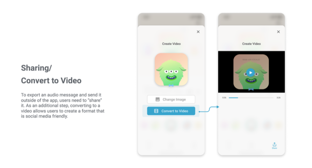
The most engaging aspect of the app is the ability to share voice messages as videos. Users can pair their chosen picture with the voice message, resulting in an expressive and impactful communication format. This feature offers users a valuable opportunity to interact with the app and share their voice creations with others.
Overall, the Voice App empowers users to communicate effectively and creatively, blending technology with personalized voice expressions for a captivating and memorable user experience.
Dive deep into Design Process
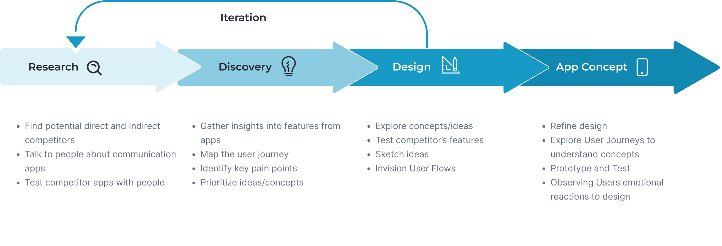
Guided by a user-centric approach, the product journey unfolds through four essential phases – Research, Discovery, Design, and App Concept – all culminating in a successful delivery. Let’s delve into each step, where learning, creativity, and insights pave the way for a transformative Text to Speech solution.
Research
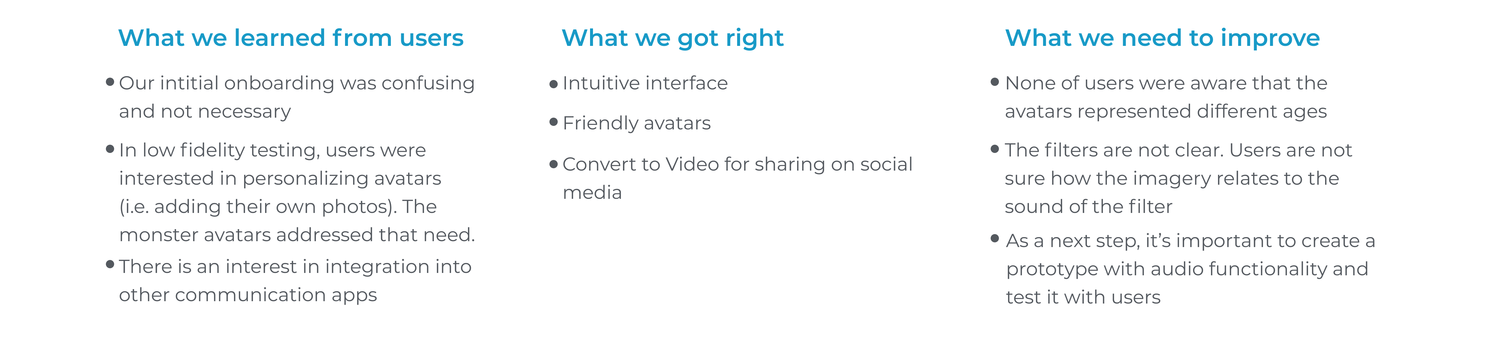
Kicking project off with the Research phase, out team dug deep to figure out the ‘who” and “why’ behind it all. We pored over competitors, chatted with users through surveys and interviews, and put our ideas to the test with real folks in user testing. All these pieces helped shape our direction and made sure we were on the right track.
potential direct and indirect competitors that have TTS (text-to-speech) or STT (speech-to-text) features and apps with customization and playfulness.
The result was that it is good to have
- different filters/effects/settings;
- the ability to share from the application to other platforms such as messengers and social networks;
- the free and limited is better than too many ads.
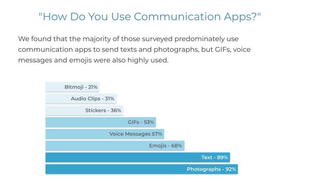
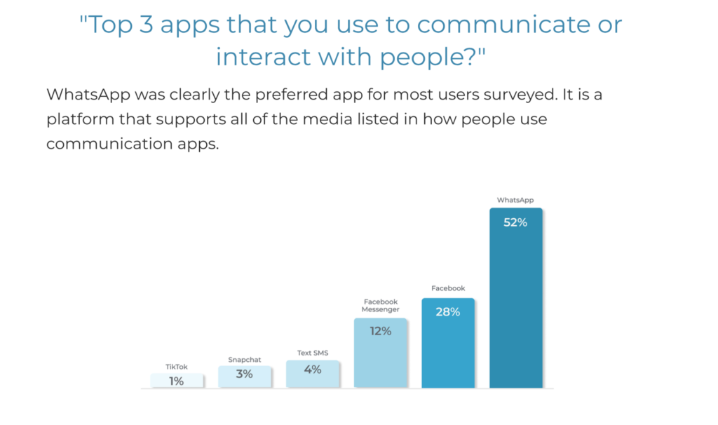
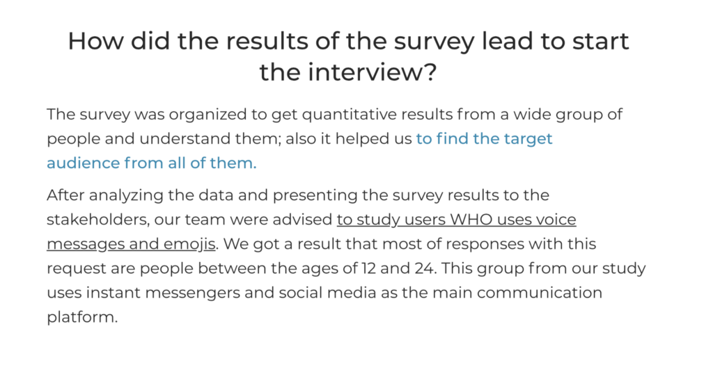
helped to understand who and how uses Voice Messaging, Emojis, and GIF in everyday communication.
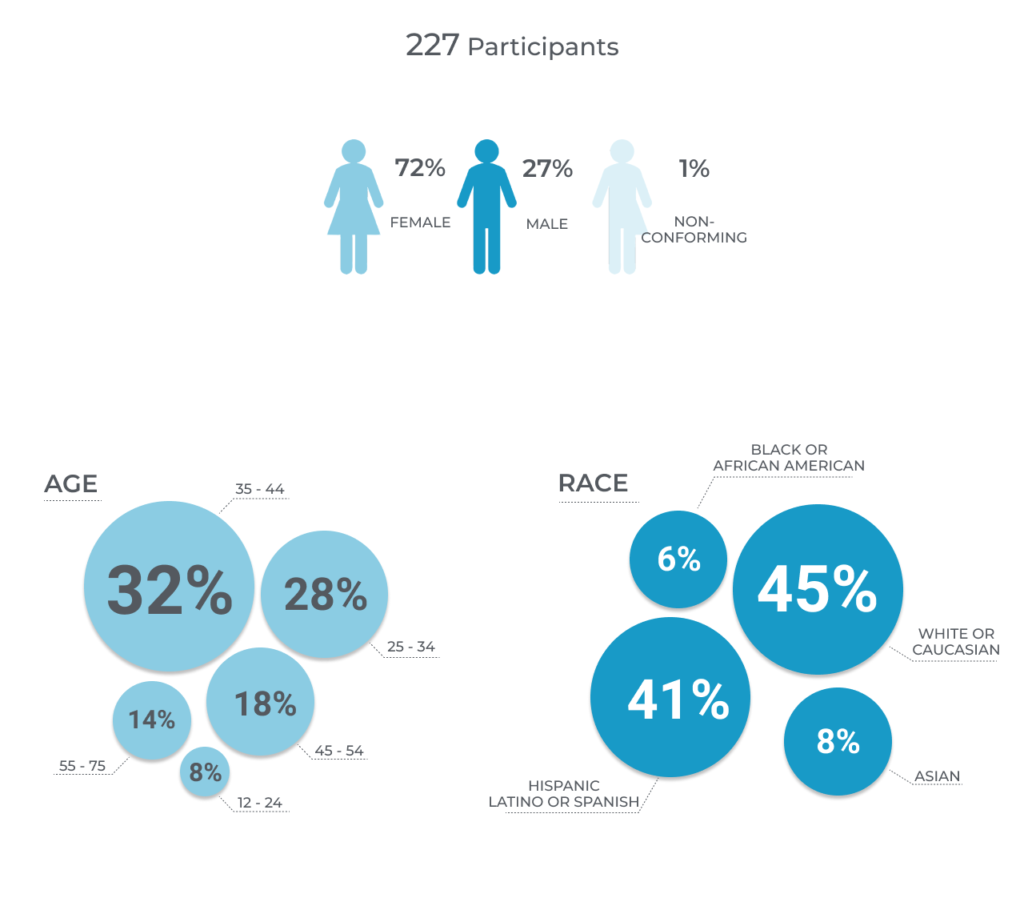
We got the result that most of the responses were from people between 12 and 24 years old. This group uses instant messengers and social media as its main communication platform.
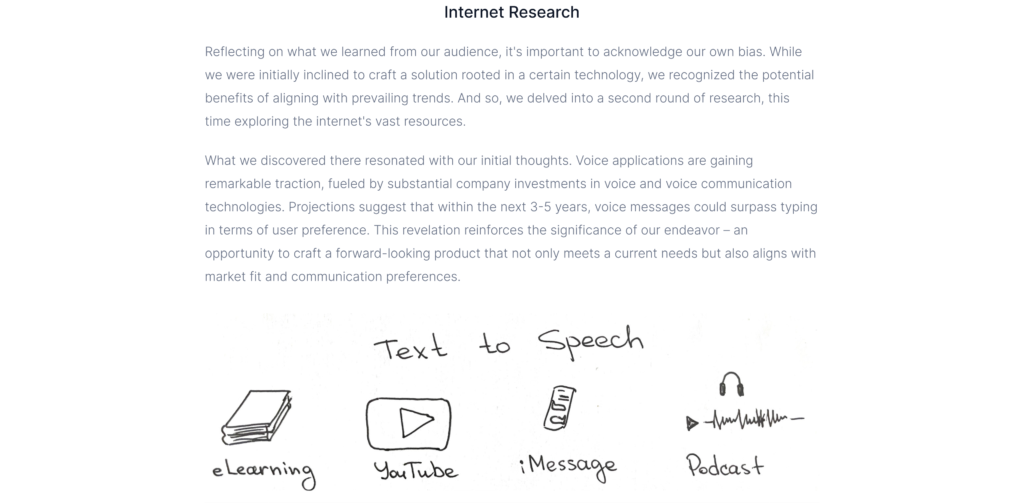
the result showed that 80% of users were unaware of existing TTS applications, except language translators and voice reading.
Everyone said they would use these apps if they are:
- easy to use;
- help create a social connection;
- the voice is less robotic, closer to human.
the result showed that users like Filters/Effects/Customization and sharing to other platforms. Users want to
- avoid ads
- unclear voices
- complicated steps
- technical issues
- confusion.

Discovery
Taking a central role, I translated the insights gathered during the Research phase into actionable steps within the Discovery stage.
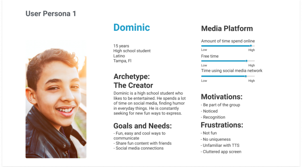
Personas
With hands-on dedication, together with team we crafted two personas, and directing our attention toward teenagers who want to be cool, unique, and connect with others in an easy and fun way.
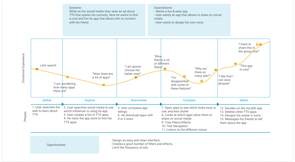
User Journeys
Guided by these personas, I meticulously mapped out the user journey, aligning every step with their aspirations. This strategic focus underscores my instrumental role in steering the project, ensuring our design pathway resonates harmoniously with existing business goals. The envisioned user journey also serves as a valuable marketing reference, aiding in communicating the product’s value proposition to potential users and stakeholders.
Before the team figured out what to focus on, we hit a roadblock during the brainstorming phase. We had a ton of information from our research and also a list of things the people who needed the product wanted. So, we went back to our original goals and came up with a bunch of cool ideas to add to the product.
Feature Prioritization
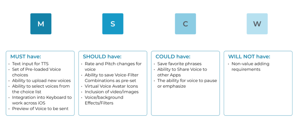
To help us decide what to do first, we introduced something called the MoSCoW method to our stakeholders. It’s like a way to sort things based on how important they are for the business. By designing for people, we also selected impactful functionality that we could deliver with less effort.
The result was a clear directive: “The application MUST include text input and a curated selection of high-quality preloaded filters and effects. The app MUST incorporate a monetization strategy for newly uploaded voices (lately moved to could). Additionally, the app COULD have the ability to share the result with other applications.”
This process stands as a testament to our commitment to developing a product that encapsulates both user needs and strategic business objectives.
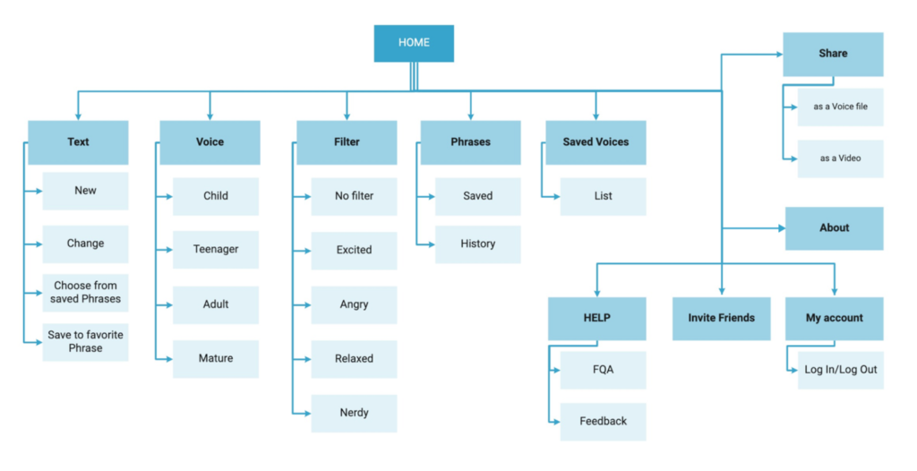
Information Architecture
As I crafted designs for seamless user engagement, my focus zeroed in on Information Architecture (IA). To me, IA acts as a blueprint for effortless user navigation and fosters communication with the engineering team. This choice was a fusion of insights from research and astute prioritization.
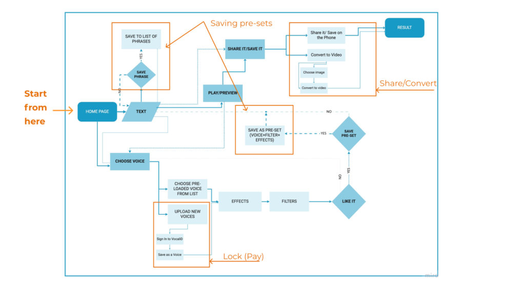
Navigation
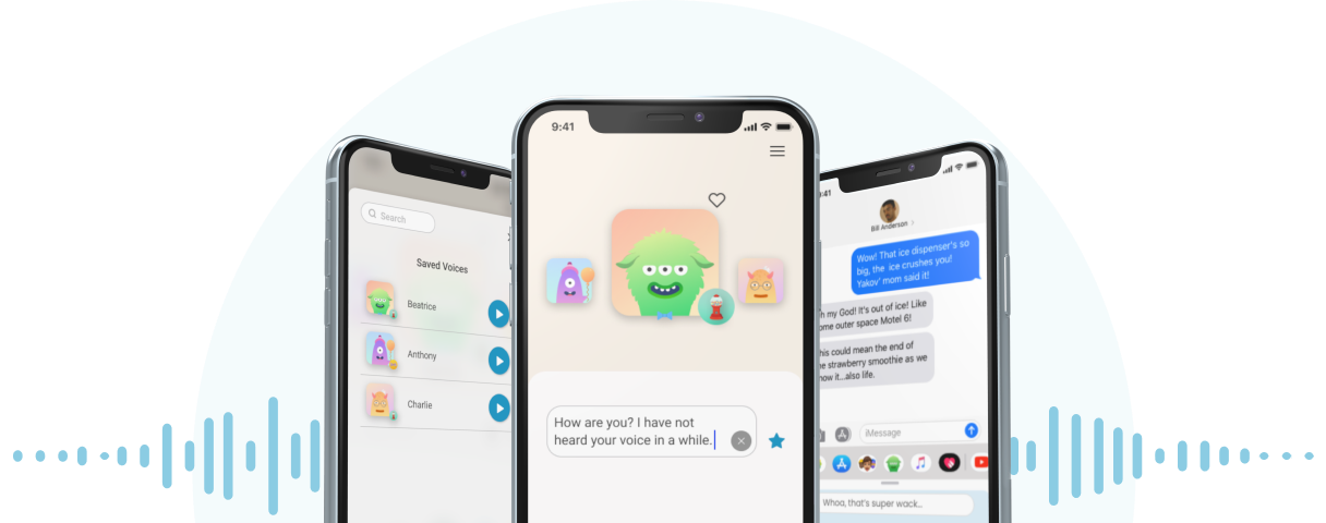
Users are empowered to choose from an array of four voices, each representing different ages. These voices can be easily combined with any of the four filters, resulting in a tailored voice creation. This unique masterpiece can be preserved as a ‘Voice + Filter’ pre-set, much like a mannequin decorated with a set of outfits.
As a strategic enhancement, I proposed guiding users to create their profiles before embarking on the journey of their unique voices. This augmentation not only enhances the experience but also opens avenues for exploring the users’ history and pre-saving results for future use, particularly for the purpose of ‘branding’ voices. Moreover, it fosters ongoing engagement with our users.
Design
Ideation
During the Ideation phase, I engaged in a comprehensive analysis of both direct and indirect competitor applications related to Text-to-Speech (TTS), audio, communication, and social media. The aim was to unearth successful features and elements that could inform our own design. Notable examples I studied included Narrator’s Voice, Instagram, and Bitmoji.
Key Elements of Inspiration:
From my observations, I identified specific elements that held immense potential for product Interaction Design:
- Central Avatar and Bottom Filters: A central avatar positioned on the screen with filters positioned at the bottom. This arrangement appeared particularly effective for engagement.
- Text-field-only Keyboard: A unique aspect was the use of a keyboard solely for text input without playback options. This decision was rooted in the technical limitations of generating AI-generated voices through typing.
- Voice Settings Pop-up: To enhance user onboarding, I observed the utility of displaying voice settings within a pop-up window. This instructional feature aimed to prevent cognitive overload upon initial app usage.
- Direct Playback from List: A practical aspect was the integration of a direct playback option for saved voices (pre-set: voice + filter + additional settings) directly from the list of voices. This was facilitated through a dedicated playback icon.
- Phrase Saving: Inspired by other applications, I recognized the value in allowing users to save and reuse phrases. This functionality added an additional layer of convenience to the user experience.
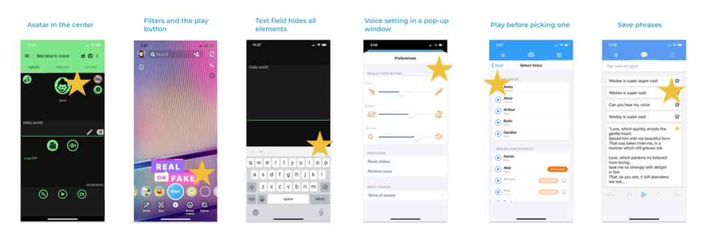
This very precise research and observation stage laid a strong foundation for the subsequent phases of the design process. It ensured that our design choices were informed by proven and effective features, while also allowing for creative adaptation to align with our product’s unique objectives and user needs.
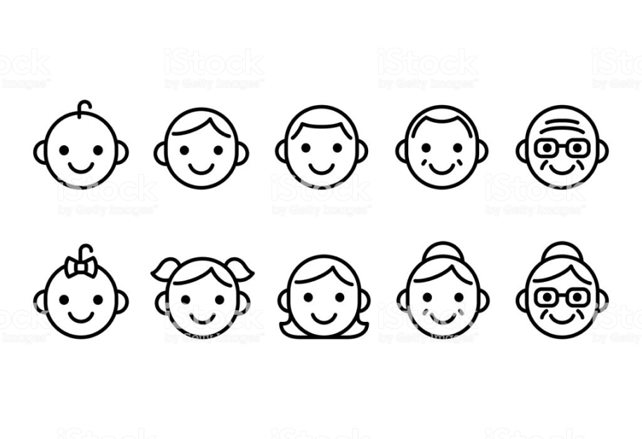
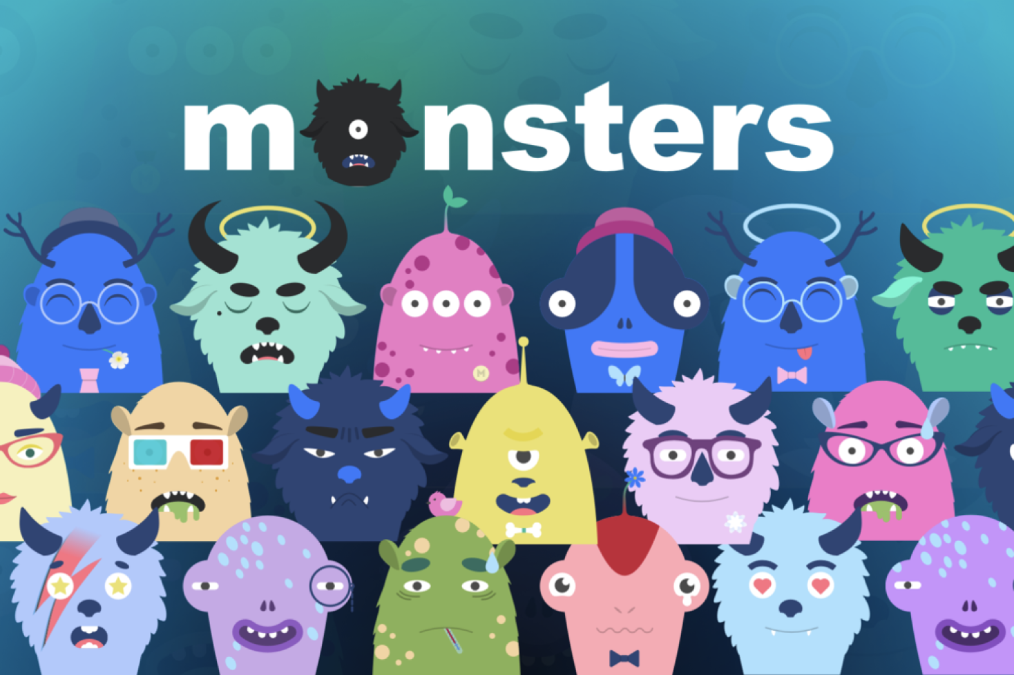
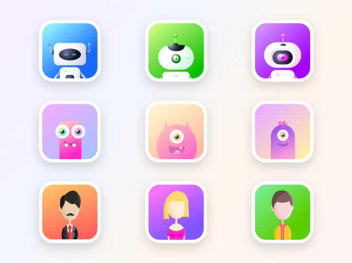
Crafting Avatars to Represent Unique Voices
Concept: As a team, we ideated avatars to embody each “voice,” choosing a playful, human-centered design instead of robotic characters.
Design Choice:
- Monster Avatars: Represented diverse voices across four life stages—child, teenager, adult, and mature.
- Colors: Each avatar had unique colors to provide more personality.
Why Monsters?:
- Inclusive & Approachable: Monsters felt relatable and represented a range of user voices.
- Visual Cues for Connection: Different colors and expressions helped communicate personality and make each avatar memorable.
Testing & Refinement: We iterated on designs to ensure these avatars provided a strong, engaging connection for users.


User Testing
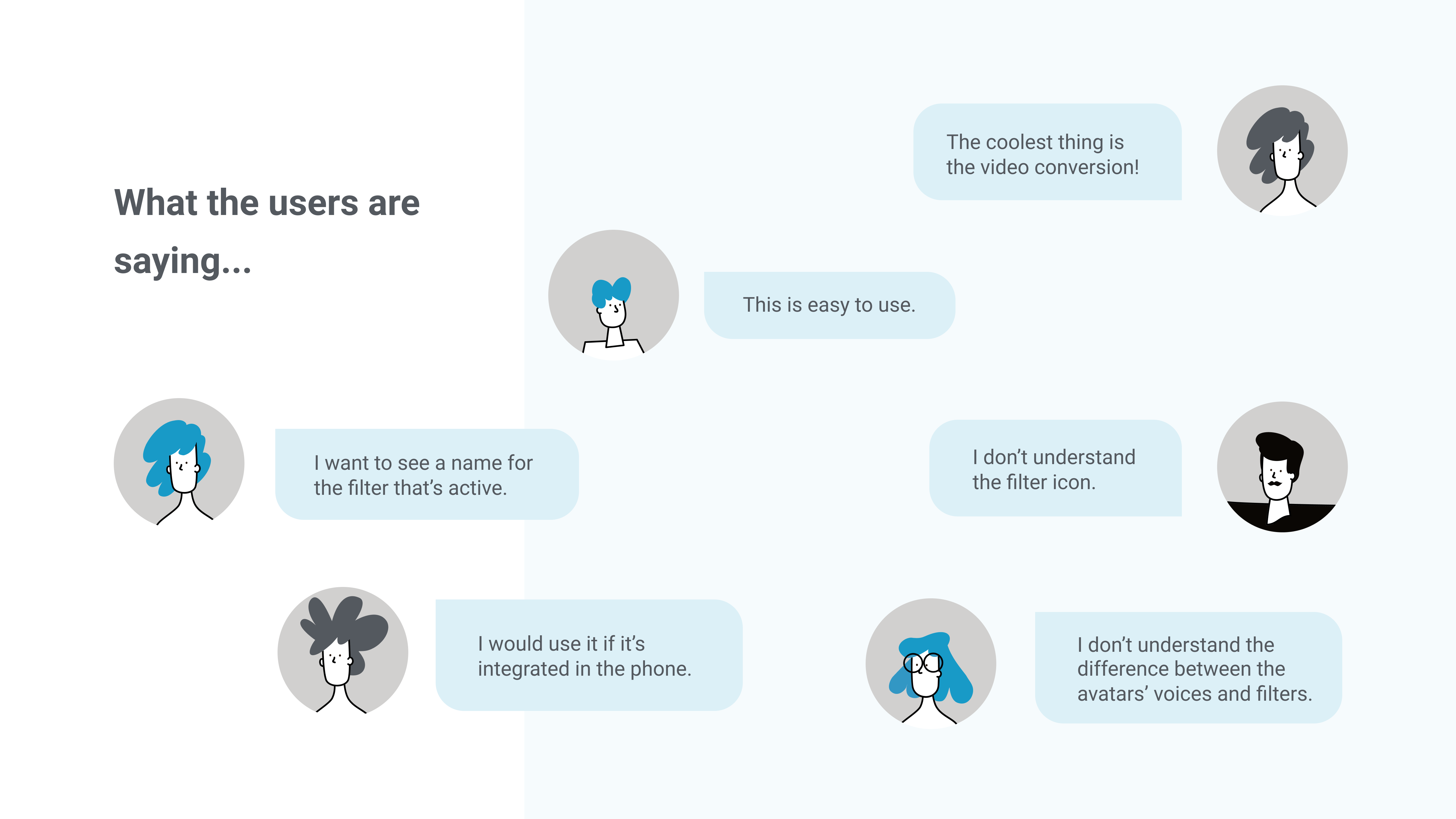
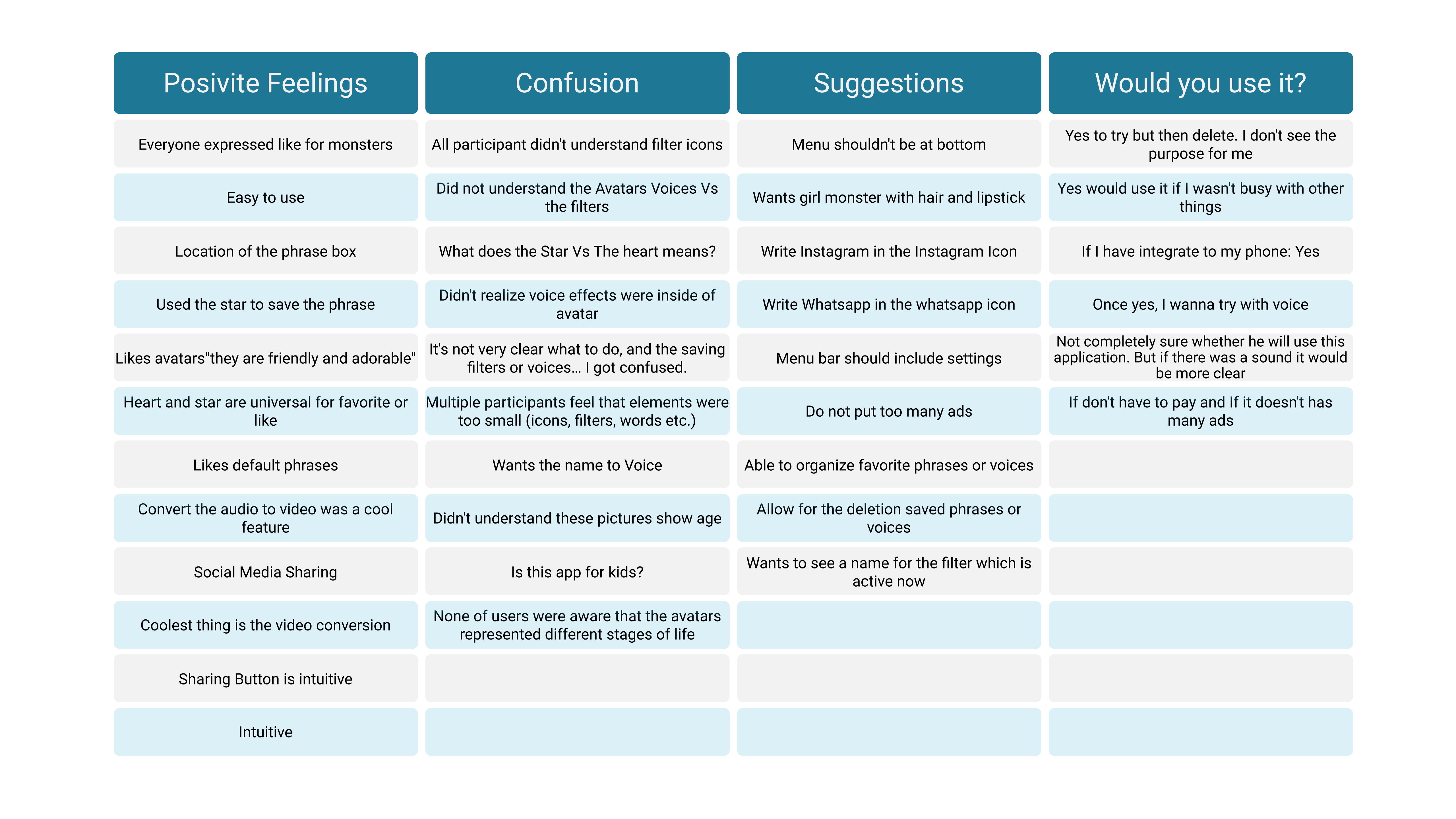
Iteration
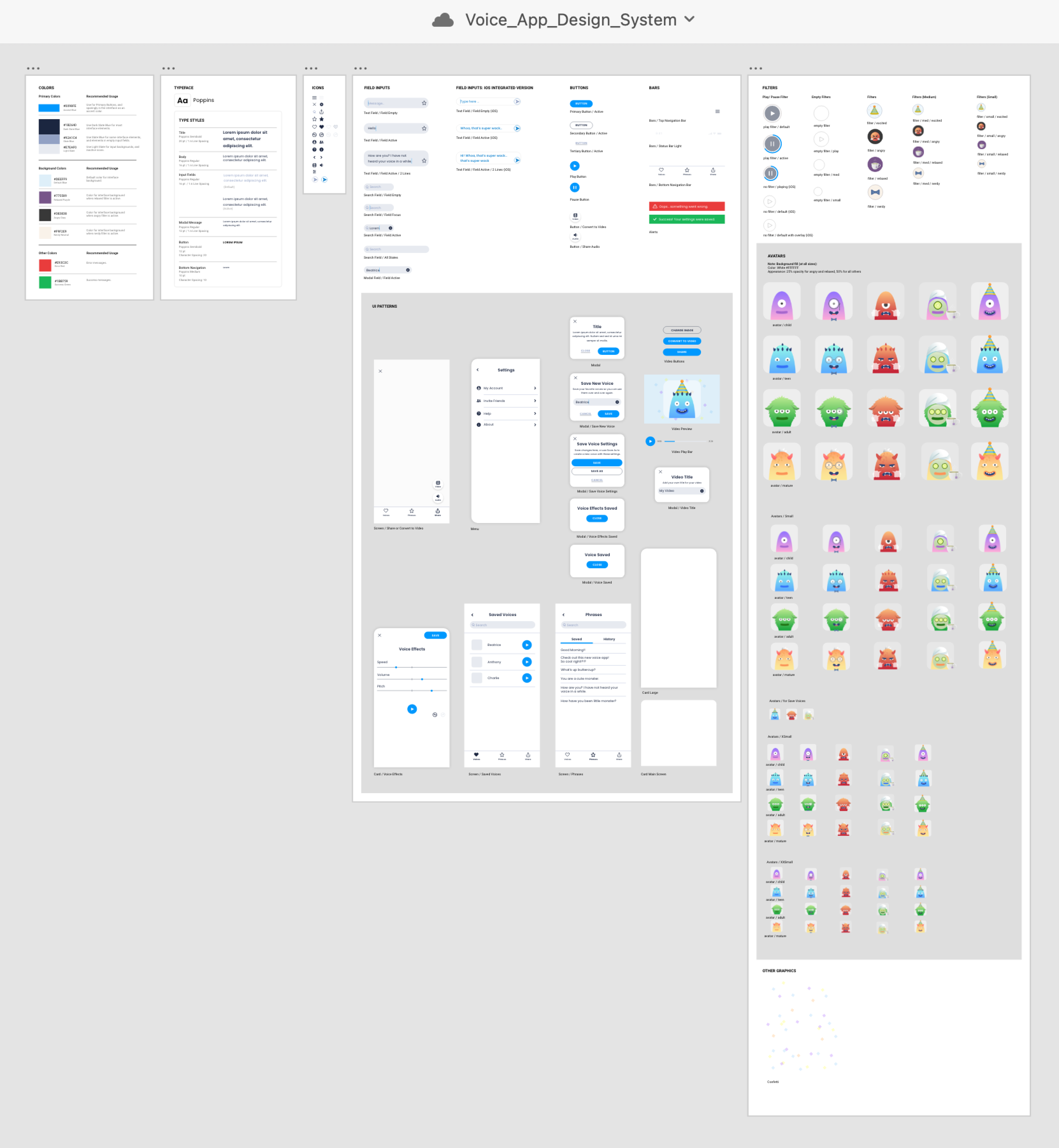
Design System
Collaborative Spirit: I had the pleasure of working with a talented Visual Designer to create playful illustrations for our app’s avatars, ensuring they felt cohesive and inviting.
Creating the Design System: We kicked things off in Figma to build a solid Design System, then transitioned everything to Adobe Creative Suite for that extra touch of magic because I wanted to test the prototype with voice functionality in Adobe XD.
Thoughtful Enhancements:
- Bigger Main Avatar & Filter: I decided to make the main avatar larger than the filters so it really stands out, making it easier for users to engage and connect.
- Personalized Naming: I added names for each avatar (can be changed), encouraging users to personalize their experience and form a bond with the voices they choose. It’s all about making the app feel more like a friendly companion!
App Concept
Functionality
-
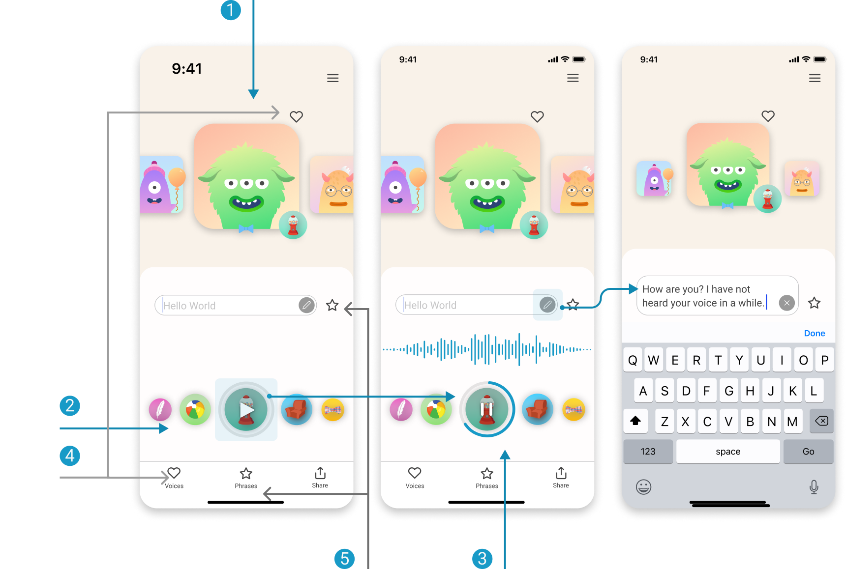
Avatars Represent Voices
Users can explore four default voices, each with a unique tone and character.- Design Principle: I used visual hierarchy to make the voice options prominent and distinct, ensuring users can easily identify and select their preferred tone. Users can quickly interact by scrolling left and right, making voice selection seamless and intuitive.
- Design Principle: I used visual hierarchy to make the voice options prominent and distinct, ensuring users can easily identify and select their preferred tone. Users can quickly interact by scrolling left and right, making voice selection seamless and intuitive.
-
Filters
With just a tap, users can apply voice filters to add extra character to the selected voice.- Design Principle: The left-right scrolling interaction places filters within easy reach, following Fitts’s Law to make frequent actions effortless and accessible. This layout was chosen to support quick, seamless exploration.
- Design Principle: The left-right scrolling interaction places filters within easy reach, following Fitts’s Law to make frequent actions effortless and accessible. This layout was chosen to support quick, seamless exploration.
-
Play/Pause
Pressing the Play/Pause button lets users hear the text aloud, with interactive visuals highlighting each sound.- Design Principle: The button’s size and position follow affordance principles, making it immediately recognizable and intuitive to press. Visual feedback reinforces interaction, enhancing user engagement and feedback clarity.
- Design Principle: The button’s size and position follow affordance principles, making it immediately recognizable and intuitive to press. Visual feedback reinforces interaction, enhancing user engagement and feedback clarity.
-
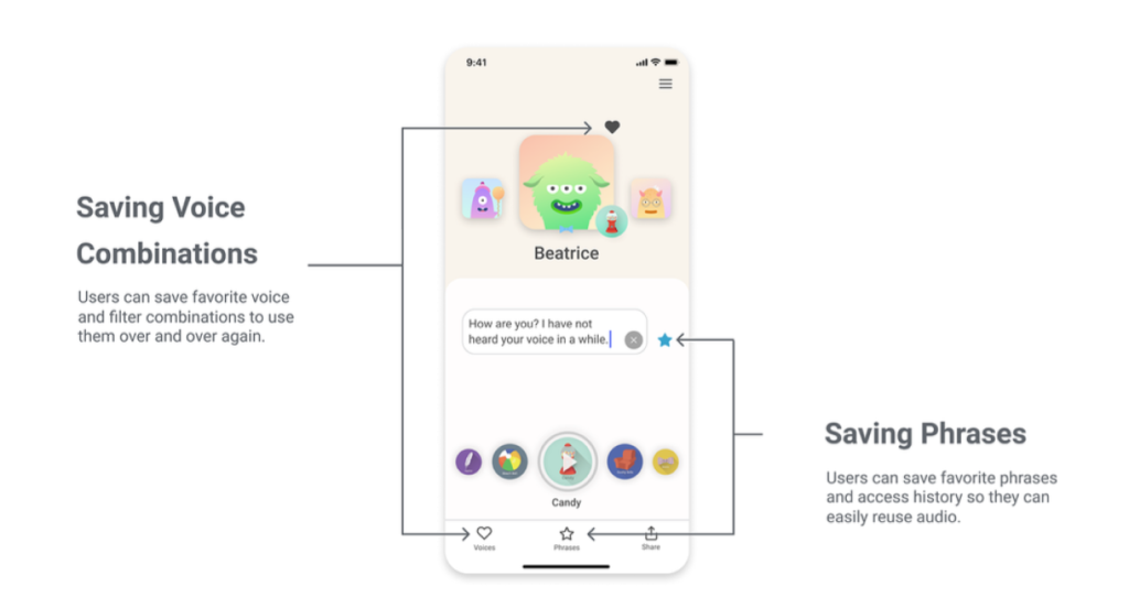
Saving Voice Combinations
Users can save their favorite voice-filter combinations to quickly reuse later.- Design Principle: Consistency and recognition over recall guided this feature, enabling users to access previously saved settings without having to recreate combinations. This approach simplifies user experience, particularly for frequent users.
- Design Principle: Consistency and recognition over recall guided this feature, enabling users to access previously saved settings without having to recreate combinations. This approach simplifies user experience, particularly for frequent users.
-
Saving Phrases
Users can save favorite phrases and view a history of past entries for easy playback.- Design Principle: The visibility of system status principle is applied here, ensuring that saved phrases and history are easily accessible. This encourages exploration while reducing repetitive input, giving users confidence that their selections are securely stored.
iMessage Extension
Functionality
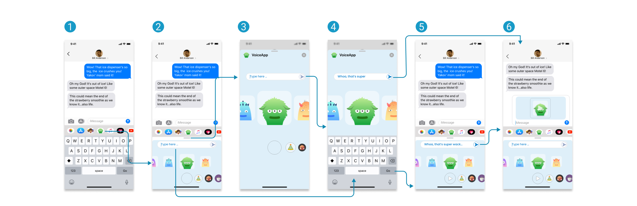
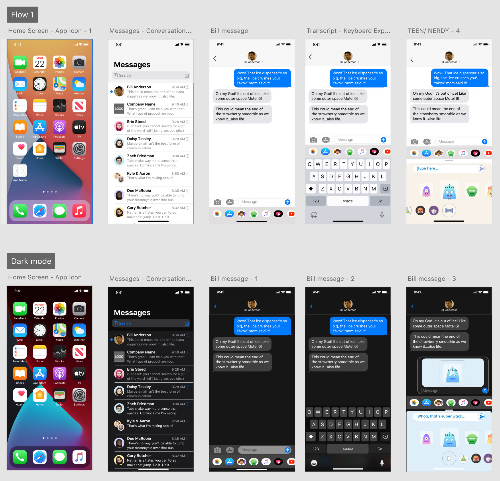
Collaborating closely with developers to understand potential limitations, I designed an iMessage integration to provide users with easier voice interaction. This integration functions as a lightweight, standalone application within iMessage, optimized for simplicity and ease of use, though it does not include memory functionality.
Keyboard App
Users are taken directly to the integrated screen within the app, they choose the app inside the iMessageText Field (Initial State)
The text field starts empty, and the Play button is disabled. When users tap on the text field, the screen expands to full screen (Step 4).Full Screen
Users can expand the screen by swiping up or tapping on a small element for a larger view.Expanded Text Field
Tapping the text box in Step 2 automatically expands the screen, even without activating the Play button. To hear the audio, users can press the Go button or tap anywhere on the keyboard.Preview
Once text is entered, users can interact with a preview of the audio message, then click a button to send it to their iMessage draft.Result
This shows how the audio message appears in the iMessage draft before sending, including a preview of the avatar along with the generated voice text.
I thoroughly tested Dark Mode to guarantee that the integration would function smoothly without any adjustments, ensuring a faster launch while minimizing engineering effort.