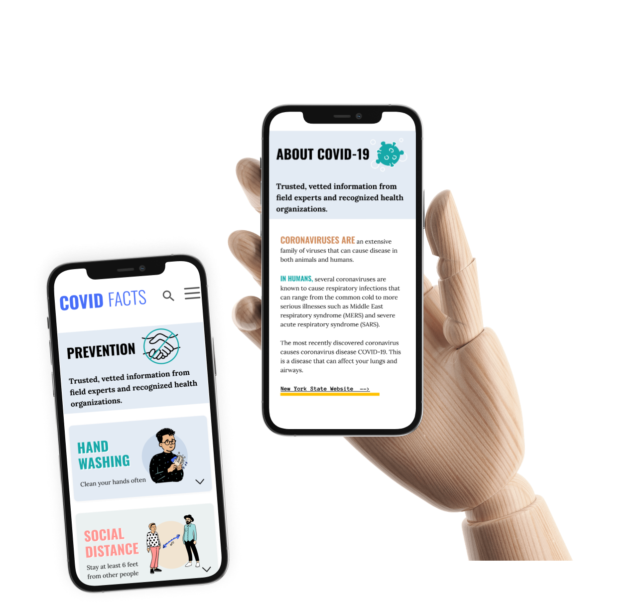
COVID FACTS is a website with up-to-date information on news and guidelines related to Covid-19.
My role
Interaction Designer
Team
Project Manager Researchers Information Architect Visual Designer
Timeline
4-day Design Spring during COVID
My Contributions
Usability Testing Research Synthesis Persona Creation User Journey Low & High Fidelity Prototyping
The Challenge
Addressing the global impact of Covid-19 on public health, behavior, and economic uncertainty
stakeholder asked
design an infographic informing people how to properly wash their hands to prevent the spread of COVID-19
but, the users showed us…
they know how to wash hands properly, but users have other questions.
So, we decided to find a better way to help everyone with their different problems caused by Covid-19.
Redefining the Challenge
We tested the assumptions of the original challenge posed. We discovered that the problem being presented did not match the real problems of those we surveyed and interviewed. We evaluated this new data and considered what our users told us they needed and wanted. This sent us on the path to finding a different solution, a different design than the one asked for.
Research
In order to effectively communicate with people about COVID-19 prevention, we conducted research to gain insights into their knowledge and feelings about the pandemic.
The first step involved quantitative research (survey) to define people’s existing awareness and challenges.
Based on the survey results, the researchers conducted user interviews with willing participants.
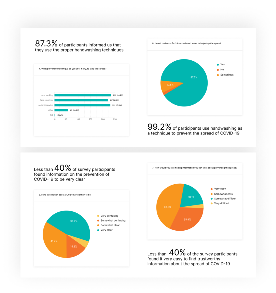
The data gathered from both the survey, and interview informed us that people already know the proper hand-washing techniques and are actively practicing them. All interview participants practice more than one technique to keep safe and prevent the spread of COVID-19.
Responded to the survey
0
Interviews
0
Total Participants
0
"Yesterday, I heard that the virus stays on surfaces for 2 days, but today's news shows 3-4 days, and only 70% rubbing alcohol helps to kill it. Who can I believe?".
Tanny Doe
Interview participant
Insights
Through these interviews, we discovered that people were struggling with diverse and sometimes conflicting information, making it challenging for them to know whom to trust regarding Covid prevention.
Overall, this research phase allowed us to identify the gaps in information and the confusion people faced, which became crucial in designing our communication strategy for Covid-19 prevention.
Re-evaluation of the challenge
We rethought our approach to the solution. Our team evaluated all data and thought about what our users were telling us they needed and wanted. This sent us on the path of finding a different solution, a different design than the one being asked for.
Discovery
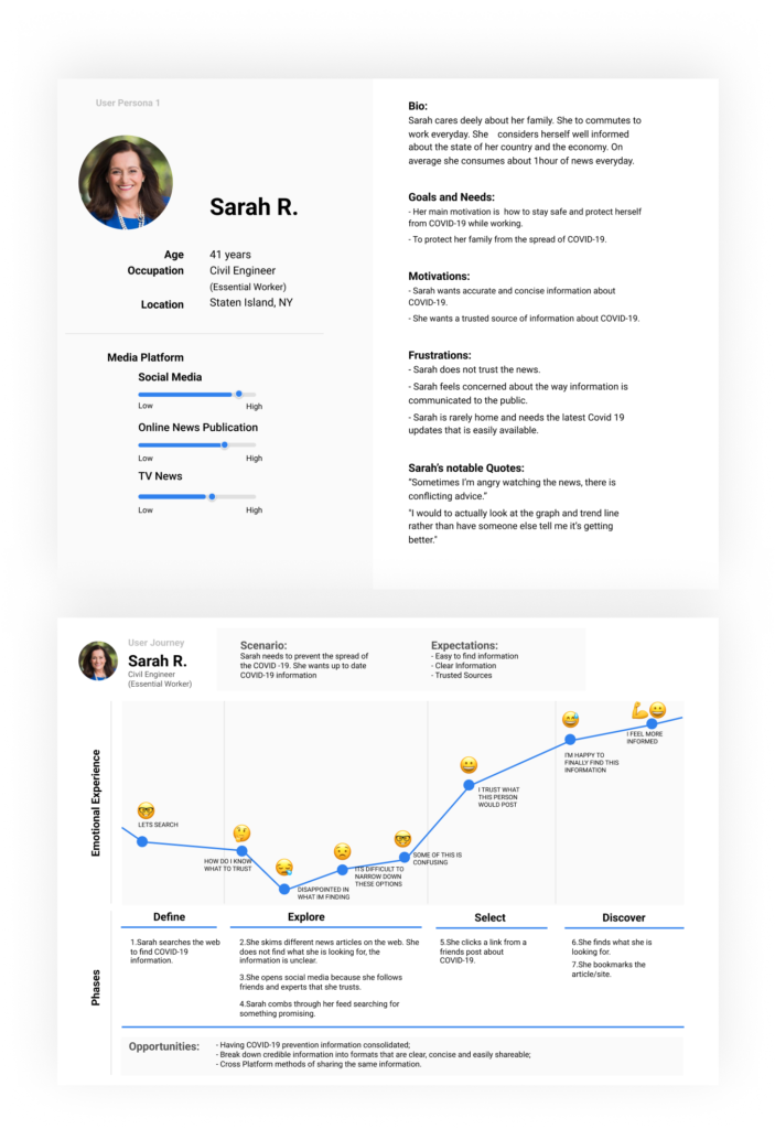
Based on the card-sorting from the research phase, we created two personas.
Sarah R. is an essential worker, and she considers herself well-informed about the state of her country and the economy. Sarah wants accurate and concise information about COVID-19. Also, she wants a trusted source of information about COVID-19.
Chin C. is a remote worker during the pandemic. Chin wants more information on how the virus lives on surfaces to keep his surroundings clean. He wants up-to-date details on how the virus spreads to ensure he is doing the right things. Our team and I referred personas throughout the entire product development process.
We began with a mobile-first web-design approach, as our users said they needed information on the go and on their mobile devices.
Design & Test
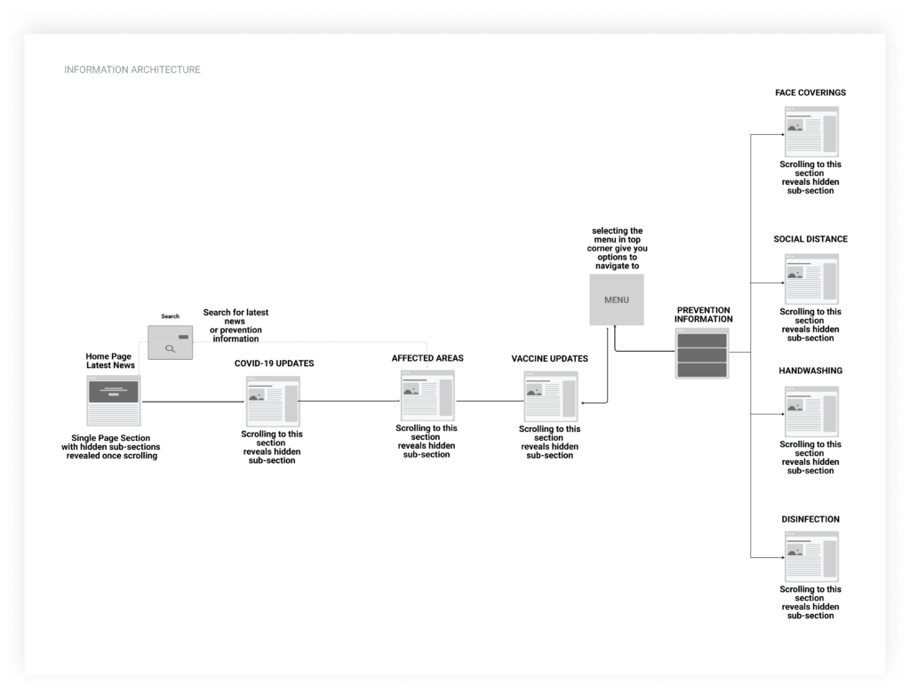
Information Architecture
Our architect has designed a process to guide the creation of wireframes which ensures that all necessary pages and connections are included.
After testing the process using user stories from 2 different Personas, we made some modifications.
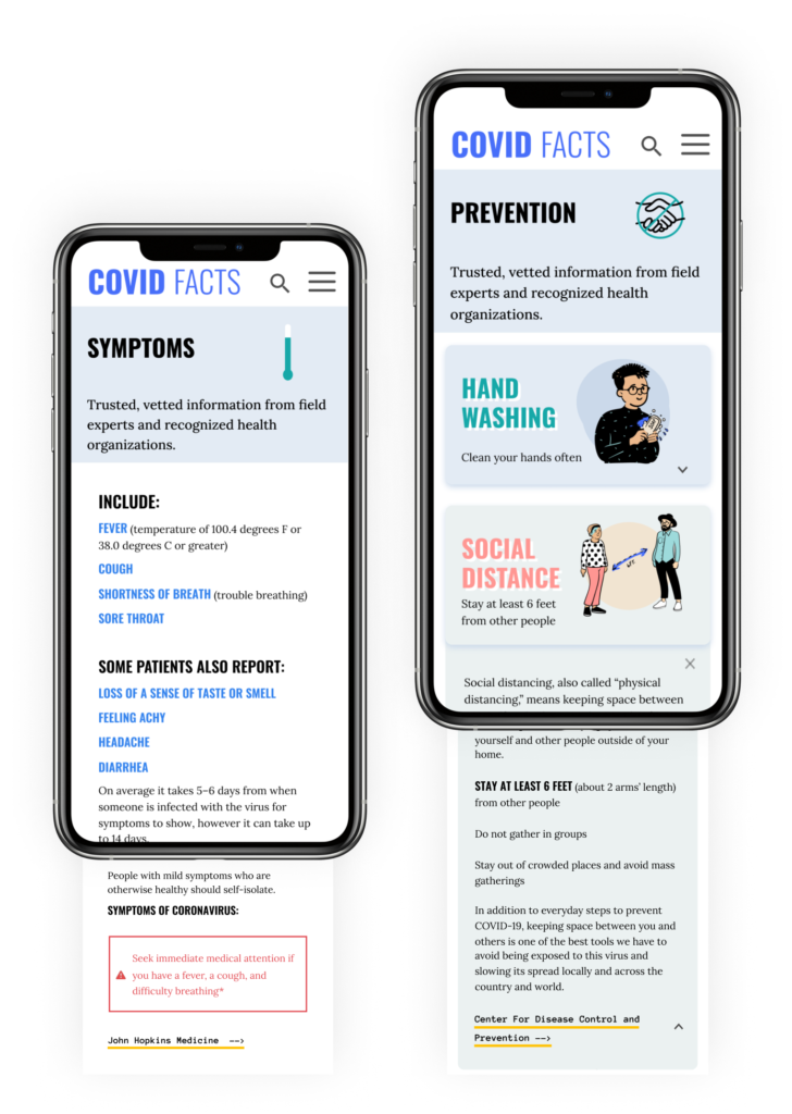
One of the changes we made was adding information on prevention, which we identified as a critical need for busy essential workers.
Wireframes
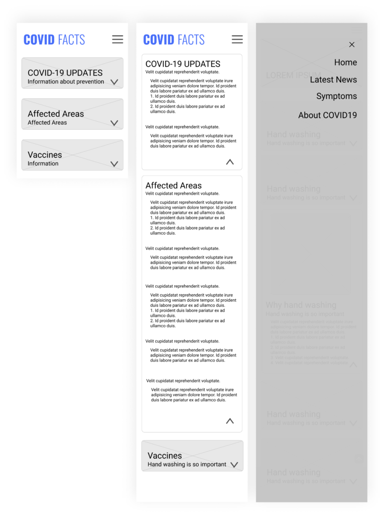
I crafted a user flow, which helped me create wireframes that included all the essential pages. I explored several solutions and developed a low-fidelity prototype to present to my team for testing.
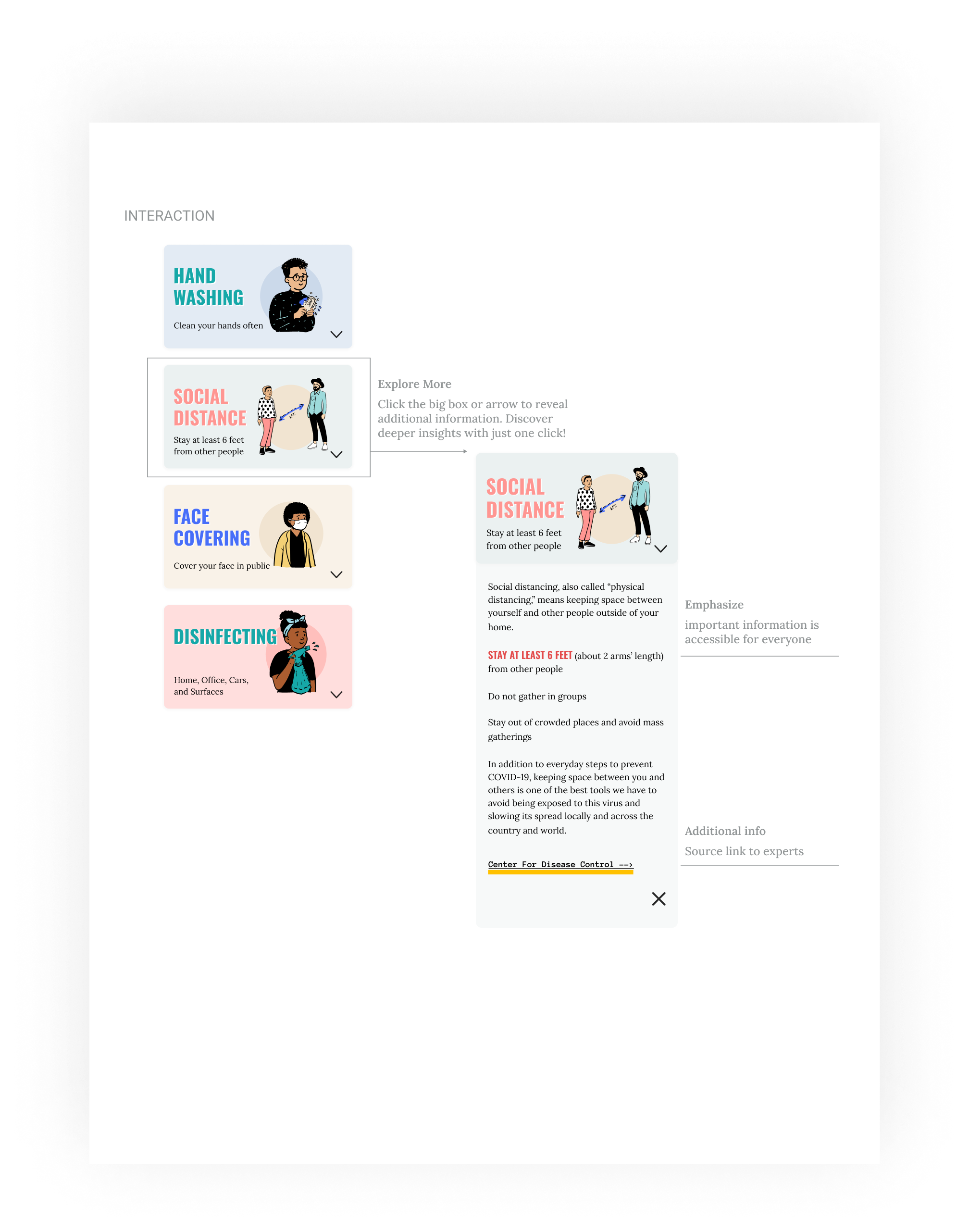
By identifying the main needs of our target users, I was able to make the navigation more intuitive and prioritize the information we needed to show first, second, and third. To make the tool more accessible, I used titles for sections and applied pictures to help convey information quickly.
For users like Sarah who are interested in learning more, they can click on details to access additional information.
User Testing
As a team, we thoroughly tested each step’s functionality with interviewed users, gaining insights into their experiences. This process highlighted the importance of simplifying the user’s journey by
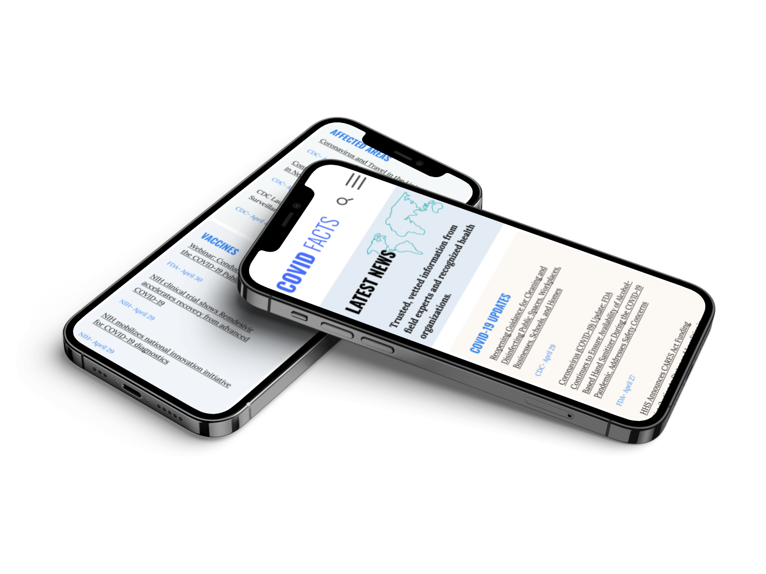
providing a search option
post the latest news on the home page
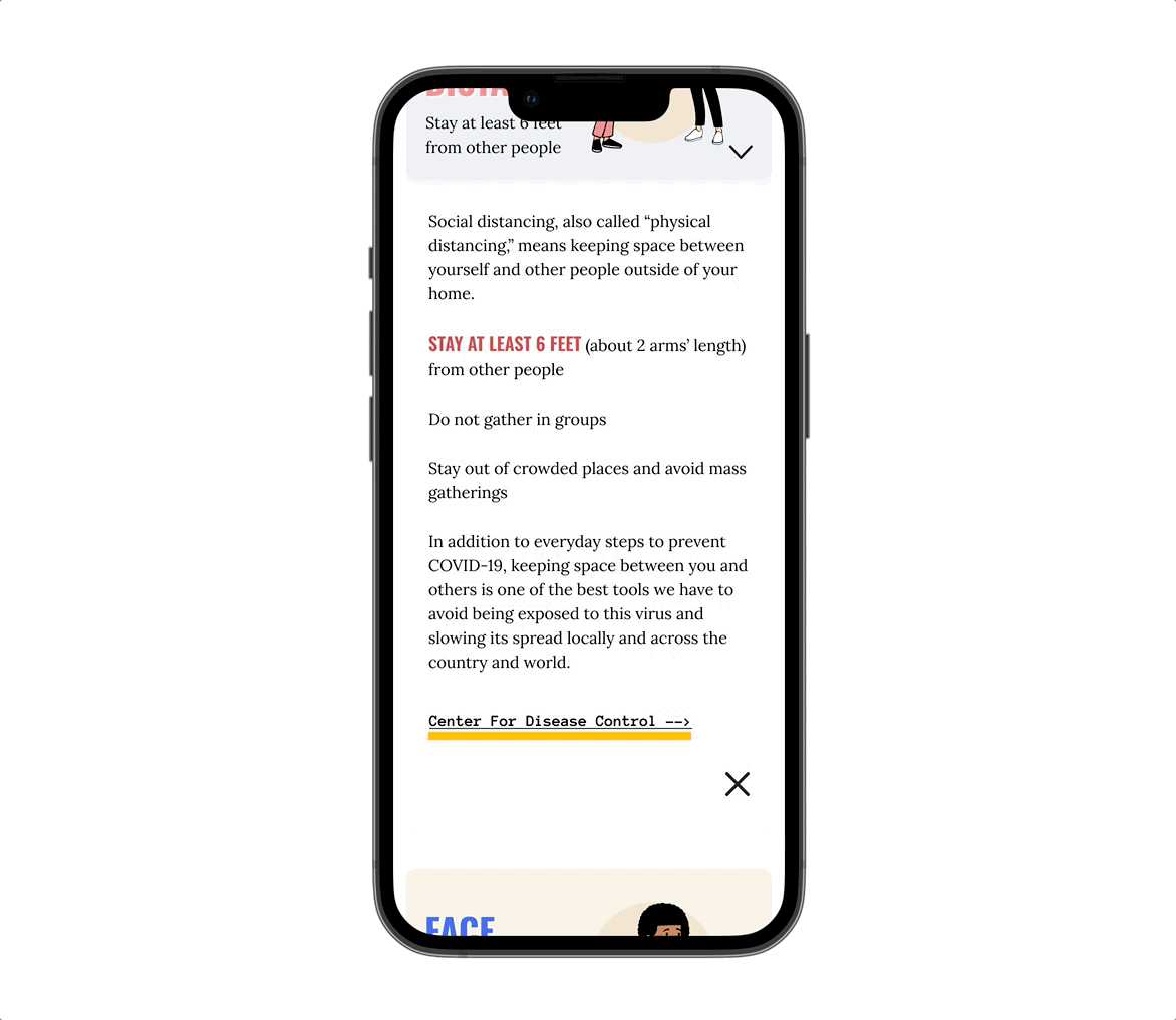
break down reliable information into clear, concise, and easily accessible formats with links to expert sources
100% users understand and easy interact with the website
The key focus was on creating a page with minimal, relevant information and implementing user-friendly interactions, such as large buttons for prevention techniques. This approach ensured easy navigation and use, providing users with precisely what they needed.
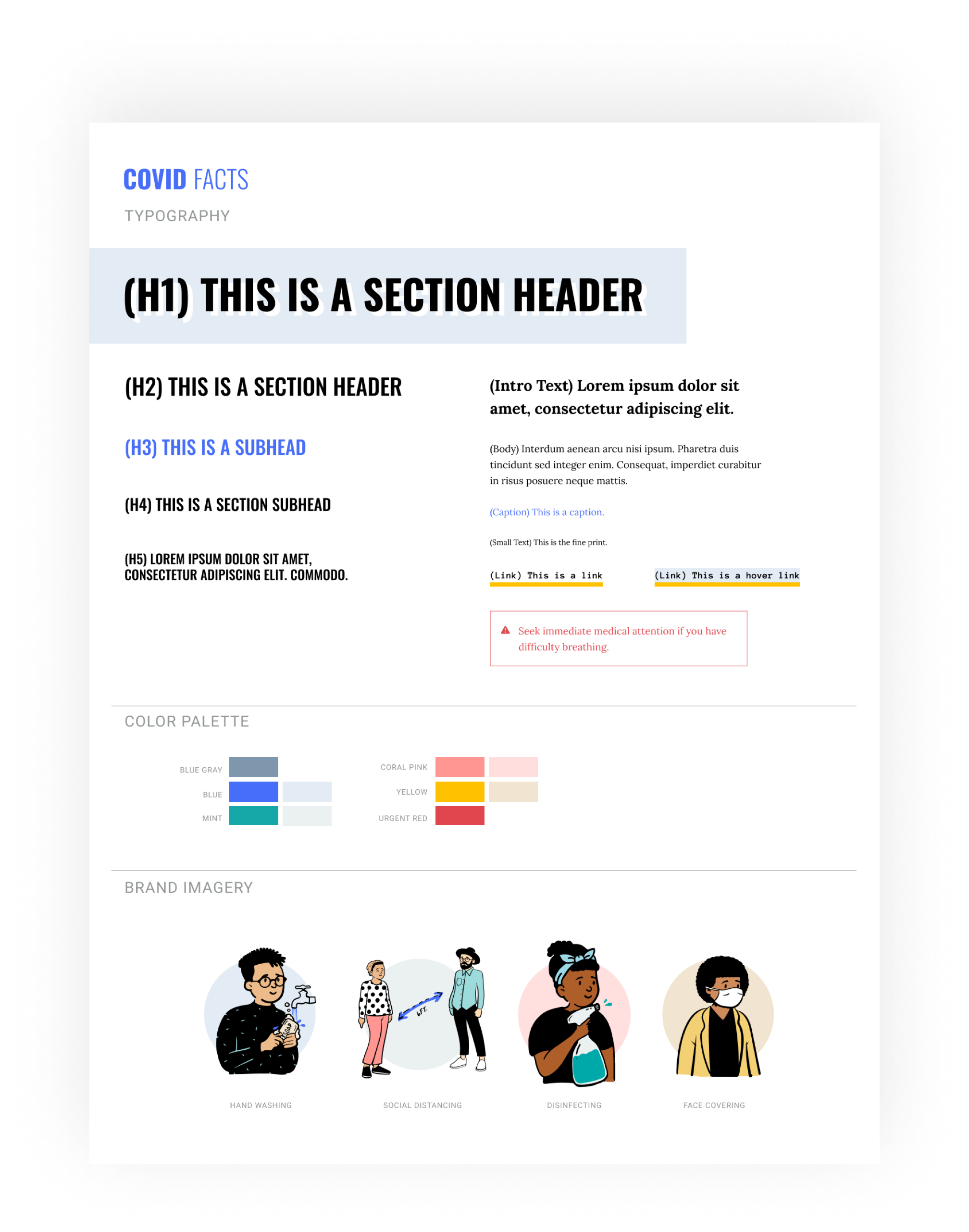
Visual Decision
In the visual decision part, we opted for a friendly, warm color palette that exudes approachability and comfort. To enhance engagement, we used lively illustrations featuring people in action, making the content relatable to users of all ages. Our design also prioritized accessibility, ensuring the information is easily understandable and navigable for young and older audiences.
Combining these elements creates an inviting and inclusive experience, fostering a positive connection with the users as they interact with the content.
Solution
People said they lacked trustworthy and up-to-date information about COVID-19, so we sought to create a website containing the latest informationon the disease, prevention, and the pandemic in general.
We also made sure to reference expert sources wherever we gave COVID-19 prevention information.
Prototype
Interactive Prototype
Lesson Learned
Our team reflected on our data collection process and discovered that our biases may have prevented us from gathering diverse and essential data. In an attempt to be sensitive to our survey participants, we neglected to include questions about race, gender, and income, which could have skewed our data toward a specific demographic. Unfortunately, it is impossible to know for sure.
The most important lesson I have learned is to prioritize the needs of users and test hypotheses over focusing solely on stakeholder solutions.
Next Steps
So, for us, the next steps would be to gather more data and test it against what we have already discovered. This is a rapidly evolving time we are living in, and what people need may shift as rapidly. We hope to design something that addresses those needs in earnest.